
UX/UI Design
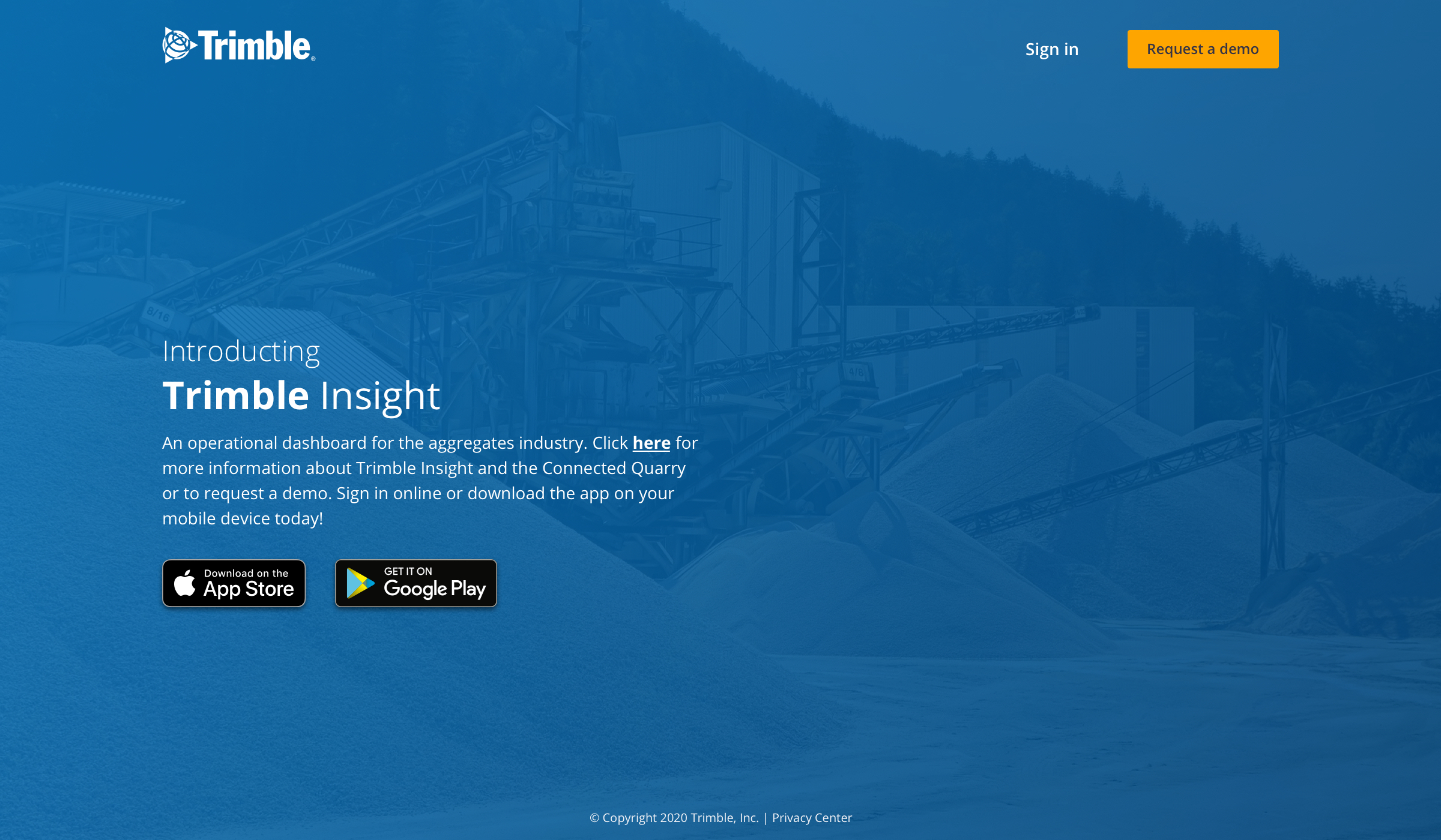
Last year, I was asked to create a solution for the Aggregate industry (think rock quarries). After starting with stakeholder interviews, competitive analyses, and some quarry visits, I realized that there was a massive opportunity for us. Quarries have been around since people started digging in the dirt, but they haven't exactly kept up with the times when it comes to new technology. So, we decided to design an operational dashboard to help monitor quarry productivity.
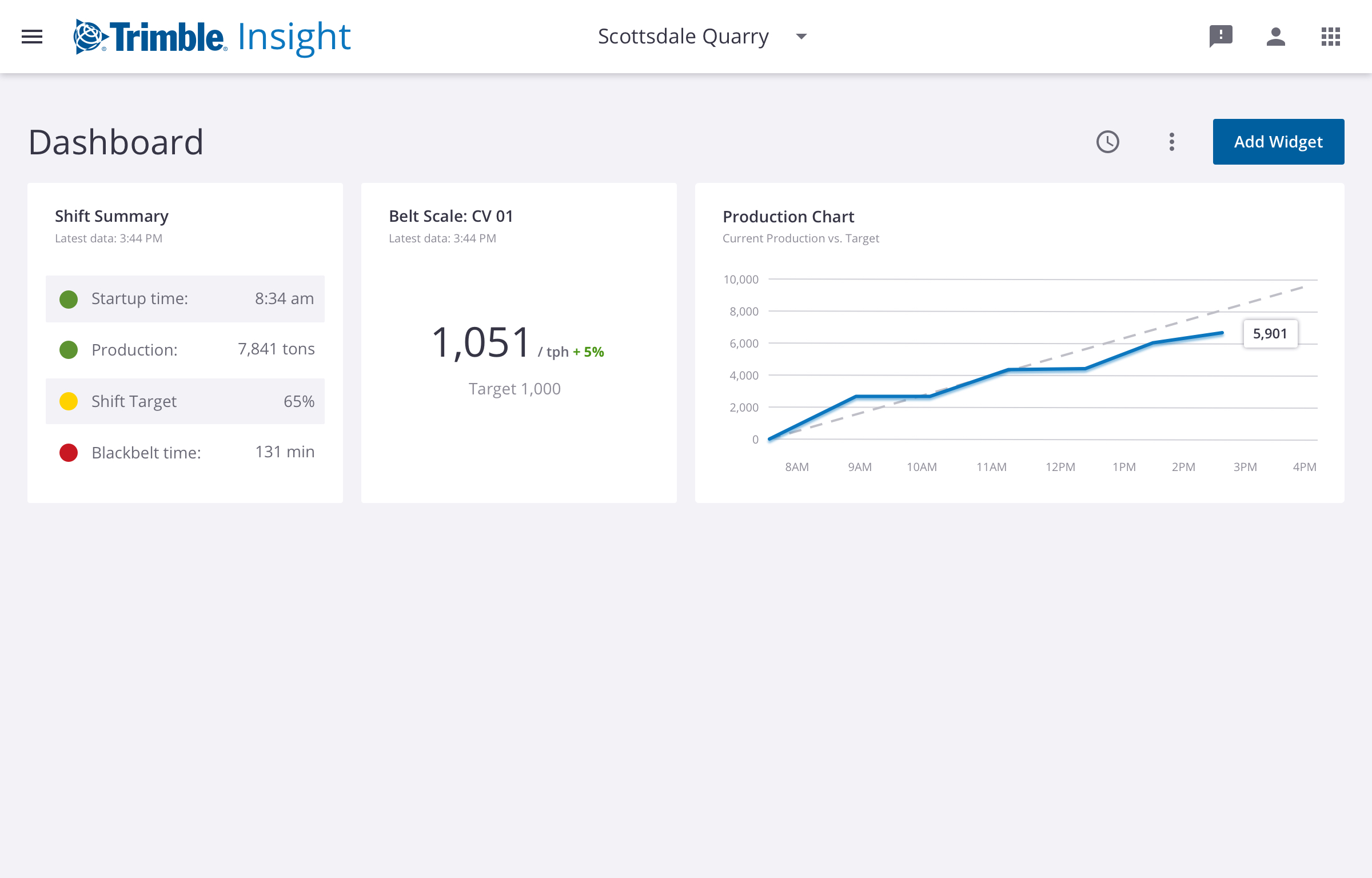
There's a need for a centralized source of reporting that a quarry manager could use to assess the productivity of their site. We needed to move away from manually keeping track of data in spreadsheets or even on scraps of paper, which is how some operations function today. And since each quarry operates with its own set of configurations and processes, the dashboard also needed to be highly customizable to address each site's needs. Out of this, we created an operational dashboard that users can populate with various widgets. These widgets measure KPIs, metrics, and other tasks, like extraction, hauling, processing, and load-out.
While a dashboard might not seem like a revolutionary concept, the industry is hungry for this kind of solution. In user interviews and tests, we validated that we were on the right track. Now that the BETA version of the product has been released, we'll continue to reach out to users and identify ways to improve the usability of the product as well as additional features we want to include in the future.
Using the Lean UX Design model, we were able to quickly develop both a responsive web app and native app supported by user research. Check out some of the designs below.

Bill Weiler
Denver, CO
Creativity, Compassion, Fun